Wall Colours That Work in an Open Plan Kitchen and Living Area

Open-plan kitchens and living areas have become a popular choice for modern homes, offering a sense of space, light, and connectivity. These versatile layouts create a sociable environment where cooking, dining, and relaxing happen in one cohesive space. However, choosing the right wall colours for an open-plan design can feel overwhelming. The key lies in selecting shades that enhance the sense of flow while also defining different zones.
Creating Cohesion with a Unified Colour Scheme
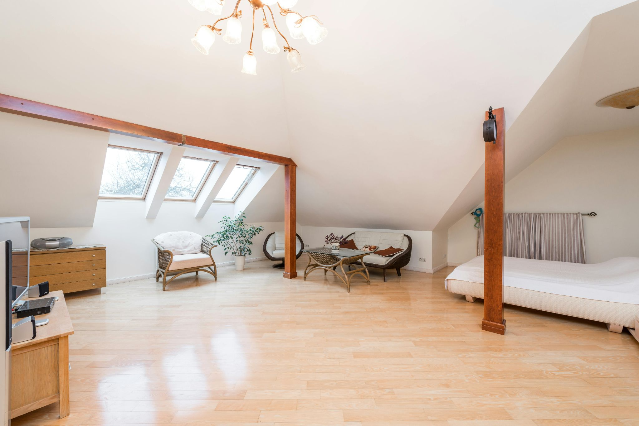
One of the most effective ways to make an open-plan kitchen and living area feel harmonious is to use a unified colour palette. Opting for the same base colour throughout the space can create a seamless flow, making the area feel larger and more connected. Neutral tones like soft greys, warm beiges, and off-whites work particularly well for this purpose, providing a versatile backdrop that complements both modern and traditional interiors.
Choosing a single colour doesn’t mean the space has to feel monotonous. Introducing different textures and finishes can add depth and interest. Matte walls paired with glossy kitchen cabinets or textured soft furnishings help maintain visual variety within a consistent palette.
Zoning with Contrasting Colours
While cohesion is essential, open-plan layouts benefit from subtle distinctions between different areas. Using contrasting colours to create visual zones can help define the kitchen, dining, and living spaces without disrupting the overall flow. For instance, painting the kitchen wall in a darker shade while keeping the living area light can provide a natural division.
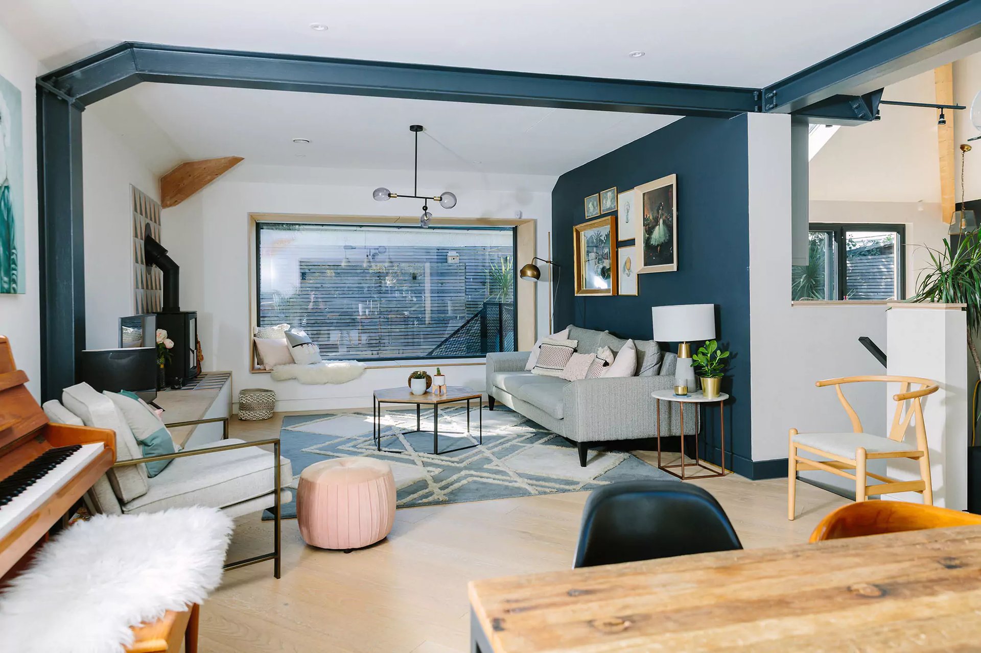
Accent walls offer a simple yet effective way to achieve this zoning. A deep navy or forest green feature wall behind the sofa can create a cosy, intimate atmosphere in the living area, while the kitchen remains bright and functional with lighter tones.
The Role of Warm and Cool Tones
Understanding the impact of warm and cool tones can help shape the atmosphere of an open-plan space. Warm colours, such as terracotta, mustard, and earthy neutrals, create a welcoming and inviting environment—ideal for family homes or social spaces. In contrast, cool tones like blues, greens, and greys evoke a calm and serene atmosphere, making them suitable for more minimalist, contemporary designs.
Balancing warm and cool tones can also work beautifully in open-plan spaces. A kitchen with cool, pale blue walls might pair well with a living area in a warm beige, ensuring the two areas feel distinct yet connected.
Using Light and Dark for Contrast
Open-plan spaces often benefit from a balance of light and dark shades. Lighter walls can make the space feel airy and open, while darker tones add sophistication and depth. For example, a soft cream base combined with charcoal or deep green accents can add a stylish contrast that enhances the room’s architectural features.
This approach works particularly well in homes with large windows, where natural light softens the impact of dark colours. In spaces with limited natural light, sticking to lighter hues can prevent the area from feeling cramped or gloomy.
Incorporating Colour Through Architectural Features
Architectural elements such as alcoves, columns, or breakfast bars offer ideal opportunities to introduce colour without overwhelming the space. Painting these features in a contrasting shade can highlight the room’s structure while subtly defining different areas.
For example, a kitchen island painted in a muted sage green against pale walls can become a focal point that naturally delineates the cooking space. Similarly, painting an archway in a deeper tone can create a sense of transition between zones.
The Impact of Natural Light on Colour Choices
Natural light plays a crucial role in how wall colours appear in an open-plan layout. South-facing rooms tend to receive warm, golden light that enhances earthy and warm shades. In contrast, north-facing rooms receive cooler light, which can make blues and greens feel more pronounced.
Testing paint samples in different parts of the room and at different times of day helps ensure the chosen colours work well in varying lighting conditions. Colours that look vibrant in a sunlit kitchen might appear dull in the shaded living area, making it essential to observe samples over time.
Using Colour to Reflect Personality
While practical considerations are important, the colours you choose should ultimately reflect your personality and style. Open-plan spaces offer the freedom to experiment with bold and expressive colours without overwhelming the senses.
Statement walls in jewel tones like emerald green or sapphire blue can add a touch of drama, while pastel shades like blush pink or sky blue bring a softer, more whimsical feel. If you prefer a more understated look, subtle variations of the same hue across walls, furniture, and accessories can create a cohesive yet personalised atmosphere.
Choosing Colours That Complement Kitchen Fixtures
The kitchen area often contains fixed elements such as cabinets, countertops, and appliances that influence wall colour choices. Neutral walls work well with bold cabinetry, allowing the fixtures to stand out without clashing with the surrounding décor.
For example, dark navy kitchen cabinets pair beautifully with pale grey or cream walls, while wooden or natural stone countertops complement earthy tones like taupe or olive green. Matching paint colours to kitchen finishes ensures the space feels coordinated and well-planned.
Adding Warmth with Accent Colours
An open-plan design can sometimes feel expansive and impersonal if the colour scheme is too neutral. Introducing accent colours through walls, artwork, and accessories helps add warmth and character to the space.
Soft, muted tones like terracotta, ochre, and sage green work well as accent colours, providing subtle pops of warmth that make the space feel more inviting. These tones can be incorporated through painted walls, feature panels, or decorative elements like cushions and rugs.
Timeless Colour Combinations for Open-Plan Spaces
Certain colour combinations have stood the test of time in open-plan interiors. Classic pairings like navy and white, beige and soft green, or charcoal and pale pink create elegant, adaptable spaces that remain stylish for years.
Monochromatic schemes are another timeless option, using varying shades of the same colour to create depth and interest. For instance, a palette of light, medium, and dark greys can add sophistication to an open-plan layout without appearing stark or clinical.
Final Thoughts on Colour Choices
Choosing wall colours for an open-plan kitchen and living area requires a careful balance of cohesion, contrast, and personal expression. By understanding the impact of different tones, textures, and architectural features, you can create a space that feels both spacious and intimate. With the right colour choices, your open-plan area will become a warm, inviting hub that reflects your lifestyle and enhances your home’s overall aesthetic.


